
AFFINGER6には特定のクラスをしていするだけでアニメーションや特殊な要素を与える機能が搭載されています。
これらの機能はAFFINGER6の通常版やEX版などに関係なく、すべてのAFFINGERで使用することができます。
簡単に誰でも使える機能だけど、AFFINGERらしく注目を集められるので、使いこなせるようにしておきましょう!
今回はアニメーションとCSSクラスについて詳しく解説していきます。

AFFINGER6アニメーションと特殊CSS
AFFINGER6ではアニメーションと特殊CSSクラスを付与することで、記事に動きを追加することができます。
実際にアニメーションを付与すると以下のようになります。
このように一定のポイントにアニメーションを付けて、記事の中で注目してほしいポイントを設定できます。
AFFINGERでは簡単に設定できて、誰でも使えるので使い方をマスターしてみましょう!
CSSクラスの使い方
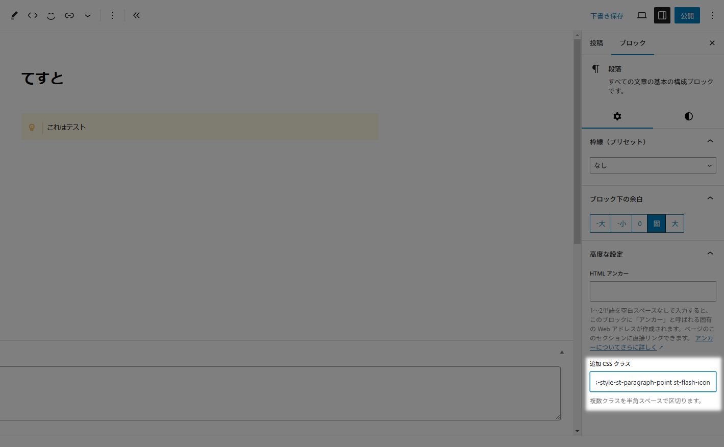
使い方は簡単で「追加CSSクラス」に該当のコードをコピペするだけです。
スタイルを適用している場合はすでにクラスが指定されています。
複数クラスを付与させる場合は半角スペースで区切りましょう。
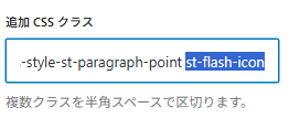
選択部分が新しく追加したクラスです。
クラスが何も付与されていない場合は詰めてOK。
半角スペースで区切らないとスタイルが適用されません。
CSSクラス一覧
アニメーションクラス
| アニメーション | クラス |
|---|---|
45°揺れ | st-wrench-icon |
ベル揺れ | st-ring-icon |
横揺れ | st-horizontal-icon |
縦揺れ | st-vertical-icon |
点滅 | st-flash-icon |
バウンド | st-bounce-icon |
回転 | st-rotation-icon |
ふわふわ | st-float-icon |
大小 | st-pulse-icon |
シェイク | st-shake-s-icon |
シェイク(強) | st-shake-icon |
拡大(ゆれ) | st-tada-icon |
過ぎる | st-passing-icon |
戻る | st-passing-reverse-icon |
バースト | st-burst-icon |
落ちる | st-falling-icon |
| アニメーション | クラス |
|---|---|
45°揺れ | st-wrench animated |
ベル揺れ | st-ring animated |
横揺れ | st-horizontal animated |
縦揺れ | st-vertical animated |
点滅 | st-flash animated |
バウンド | st-bounce animated |
回転 | st-rotation animated |
ふわふわ | st-float animated |
大小 | st-pulse animated |
シェイク | st-shake-s animated |
シェイク(強) | st-shake animated |
拡大(ゆれ) | st-tada animated |
過ぎる | st-passing animated |
戻る | st-passing-reverse animated |
バースト | st-burst animated |
落ちる | st-falling animated |
AFFINGER6で使えるブロックに適用することができます。
個人的には全体よりもアイコンを動かして注目させるのをおすすめしています。
アイコンの使い方も別の記事で解説しています。
特殊クラス
| クラス | 適応されるCSS |
|---|---|
| pa0 | padding: 0px!important; |
| ma0 | margin: 0px!important; |
| mt0 | margin-top: 0px!important; |
| mt10 | margin-top: 10px!important; |
| mt20 | margin-top: 20px!important; |
| mt30 | margin-top: 30px!important; |
| mt-10 | margin-top: -10px!important; |
| mt-20 | margin-top: -20px!important; |
| mt-30 | margin-top: -30px!important; |
| mb0 | margin-bottom: 0!important; |
| mb10 | margin-bottom: 10px!important; |
| mb-10 | margin-bottom: -10px!important; |
| mb-20 | margin-bottom: -20px!important; |
| noradius | border-radius: 0!important; |
| radius10 | border-radius: 10!important; |
| radius20 | border-radius: 20!important; |
| radius30 | border-radius: 30!important; |
| center | text-align: center; |
| sp-center | text-align: center;(※599px以下のみ) |
| st-opacity | opacity: 0.8; |
| st-cover | 要素を選択不可に |
| st-reflection-on | 光る演出 |
| gap-0 | gap: 0!important; |
| scroll-x | カラムブロックを横スクロール(カラムブロックのみ) |
| scroll-x.w50 | カラムブロックを2列で横スクロール(カラムブロックのみ) |
| st-notosans | font-family: 'Noto Sans JP', sans-serif!important; |
| st-m1c | font-family: 'M PLUS Rounded 1c', sans-serif!important; |
| st-box-shadow | ドロップシャドウを追加 |
| kanren | 「関連」ラベル ※埋込URL(ブログカード)専用 |
| popular | 「人気」ラベル ※埋込URL(ブログカード)専用 |
| check | 「確認」ラベル ※埋込URL(ブログカード)専用 |
| important | 「重要」ラベル ※埋込URL(ブログカード)専用 |
ブロック要素に様々な要素を追加することができます。
AFFINGERでおなじみの光る要素やドロップシャドウも選べるので、かなり柔軟に使えるクラスです。
指定ブロック専用クラス
| クラス | 適応されるCSS | 対象のブロック |
|---|---|---|
| bound | 少し動かす | 会話ふきだし |
| stop | 少し動かすを止める | 会話ふきだし |
| kome | 「※」マークにする | リスト |
| h-100 | 高さを100%にする | カバー |
| kanren | 「関連」ラベル | 埋込URL(ブログカード) |
| popular | 「人気」ラベル | 埋込URL(ブログカード) |
| check | 「確認」ラベル | 埋込URL(ブログカード) |
| important | 「重要」ラベル | 埋込URL(ブログカード) |
補助的な装飾スタイルなので、段落スタイルなどブロックやデザインによっては正常に反映されない場合があります。

